
Data triangulation shows positive signs all around.
May 8, 2020I think it’s safe to say that in the world we live in today, data can be pretty easy to spin in order to validate pretty much ANY opinion.
I personally try to combat this by something called data triangulation.
Triangulation simply means using more than one method (and generally 3) to collect data on the same topic to make a (better) informed decision.
This is a way of assuring the validity of research through the use of a variety of methods to collect data on the same topic, which involves different types of samples as well as methods of data collection.
So today, in order to get a clean look at how the overall real estate market is trending… I’m going to look at three different sources and share my thoughts on each.
My hope in doing this is so my friends and clients in the real estate industry can use this data as a talking point with their buyers and sellers.
No spinning of the numbers one way or another… just raw data for you to use if needed.
Keep in mind, I’m no economist. I’m just a guy that likes looking at data and drawing some conclusions from it. You may have different conclusions, and that’s OK.
Year Over Year Listing Numbers
Mike Delprete, one of the smartest real estate data consultants I know, recently released a cool tool that shows data points around the number of new listings in major metro markets.
The data points shown are calculated by looking at the new listing data for each major metro market, comparing year-over-year new listings in the market, with the number of days starting at the point that the market hit a >5% decline year over year.
The resulting graph gives you a good idea of whether or not that market is trending one way or another when it comes to new listings as we all know this type of information can be invaluable when speaking with someone who’s wondering if it might be a good time to list their home for sale.
You know, the whole supply & demand thing…
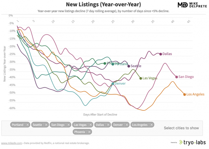
Nation wide, the drop in new listings vs last year at this time varies between 40 and 80 percent.
New York, Pennsylvania, and Michigan have been the hardest hit markets, which is a reflection of more stringent lockdown measures.
However, as you can see, several markets were recently on the upward trend and then show another quick drop.
My take on this is that while there’s still plenty of uncertainty surrounding all the Covid 19 issues, it’s simply due to the fact that in a “normal” market (like last year) new listings jump dramatically this time of year as we head into the main selling season. So, the graphs are just reflecting that slower growth as opposed to 2 weeks ago when we had a bit of a pre-emptive listing frenzy.
Note: for our example, I specifically chose the markets that Williston Financial Group (WFG National Title/WEST) have direct operations in.
If you’re in a different major metro market and want to see how your area compares, Mike’s tool can be found here on his website.
Year Over Year Showing Numbers
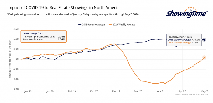
Our friends over at ShowingTime are gracious enough to share their data for all real estate showings in North America on a rolling weekly average.
As you can see, the data shows that through mid-March the average showing activity was trending higher compared to 2019 but once the Covid related stay-at-home orders were initiated, we had a large drop.
This makes sense.
Now, as some of us have begun adapting to new ways of doing business with virtual showings, etc. we are beginning to see the number of showings finally starting to creep back up into the positive.
CNBC just reported that mortgage applications to purchase homes increased 7% this last week, with 3 straight weeks of increases.
We’ve still got a long ways to go to get back up to the 2019 numbers, BUT this is promising and shows that buyers appear to be slowly getting back out into the market after the initial fear of a coronavirus-stricken economy fades.
Calculating Consumer Intent
Will the above trends continue?
Hard to say.
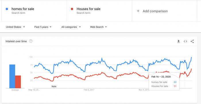
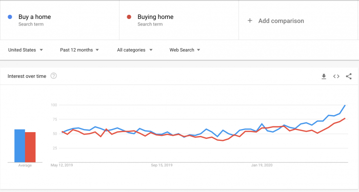
But, Google has a pretty sweet tool that I use fairly often for answering this question.
Google Trends allows you to see trends in consumer Google search traffic, and while it’s definitely hard to draw a solid line from A to B when it comes to someone searching on Google to then purchasing or selling their home… I feel you CAN judge overall consumer intent in the short term future if you look at intent based phrases over time.
In our case, I looked at 4 high intent buying terms.
Here’s the result for Home for Sale/Houses for Sale.
And here’s the result for Buy a home/Buying a home.
As you can see in the first graph (homes/houses for sale), the data shows a sharp drop mid February that doesn’t align with previous years patterns, but then a very quick resurgence spike in the last week that takes us right back up with the 5 year average for this time of year.
The 2nd graph shows a fairly healthy increase in the last month for the direct intent terms of buying a home. Note, I switched it from 5 year average to 12 month average just because it was easier to read as far as the dates go. If you’d like to explore the trends and see the 5 year average numbers for yourself (they’re equally impressive), here’s the link to do so.
So What’s The Verdict?
I’ll keep this short and sweet.
With intent based online searches (again, not an exact science) rising to all time highs, the slow but steady increase in buyers out viewing homes creating higher demand, and the fact that in most markets we have a smaller number of listings on the market than “normal” creating lower supply… I think it’s safe to say the overall real estate market is going to continue to be very healthy as we stumble through the rest of 2020.


Comments